Its a Process
I recently worked on a really cool project for a teen music festival/party/amazingness. The logo for this event had to fun and energetic yet not too childlike. I set out with the main goal of creating a really cool word mark. I'm going to be vulnerable here and show you my process, the good, the bad and the really really ugly. I'll walk you through what I was thinking and what happened along the way.
Here we go.
It all starts off here for me. I find that when I go straight to the computer with an idea and try to work something up it takes twice as long. The good ol pencil and paper is always a good starting point for me. Here I'm trying to just get down what I have in my head. I'm trying to figure out what works and what is possible. As I worked through these I saw a couple things that I liked and some that I hated. Sometimes this stage can take the longest. I grabbed a couple ideas and moved to the computer.
This was the first option I worked up. I really like the energy and the way the letters interacted with each other. I could see this as an animation and liked the chunky playful type.
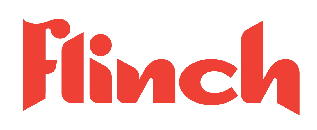
After looking at the first one I thought it was too complicated and busy I wanted a version that was toned down, simple yet bold. I played with a typeface and worked this version up.
Lastly was this option. Its super rough so don't laugh to hard. But it was only to show the concept of doing a wordmark that read more as a graphic. The plan was to do it by hand but I didn't want to do all that work and then the client not like it and go with another option. This was explained and these three options rounded out the first round.
The client came back with positive feedback and ultimately landed on the visual direction of the last one. Which was cool, just meant a lot more work to do. I headed back to the drawing board and wanted to do something with an existing typeface like the third option.
I worked up this fourth option which had really cool shapes and details. It read as a graphic and I could totally see this as a logo. But throughout the process of creating this I lost sight of what the logo was actually for. I was focused on making a cool mark, this mark turned out a little to biker-is and a little to tough for the current event. I lost that playful energy and I didn't to it by hand like I pitched the idea I would. This had me heading back the drawing board. Literally.
This is where I landed, after an hour of sketching and coming up with different letterforms. I felt like this was a good direction, it wasn't perfect but it was enough to get me started. I liked the energy, in my head I could see it playing out. I got it approved by the client then I moved on to the computer.
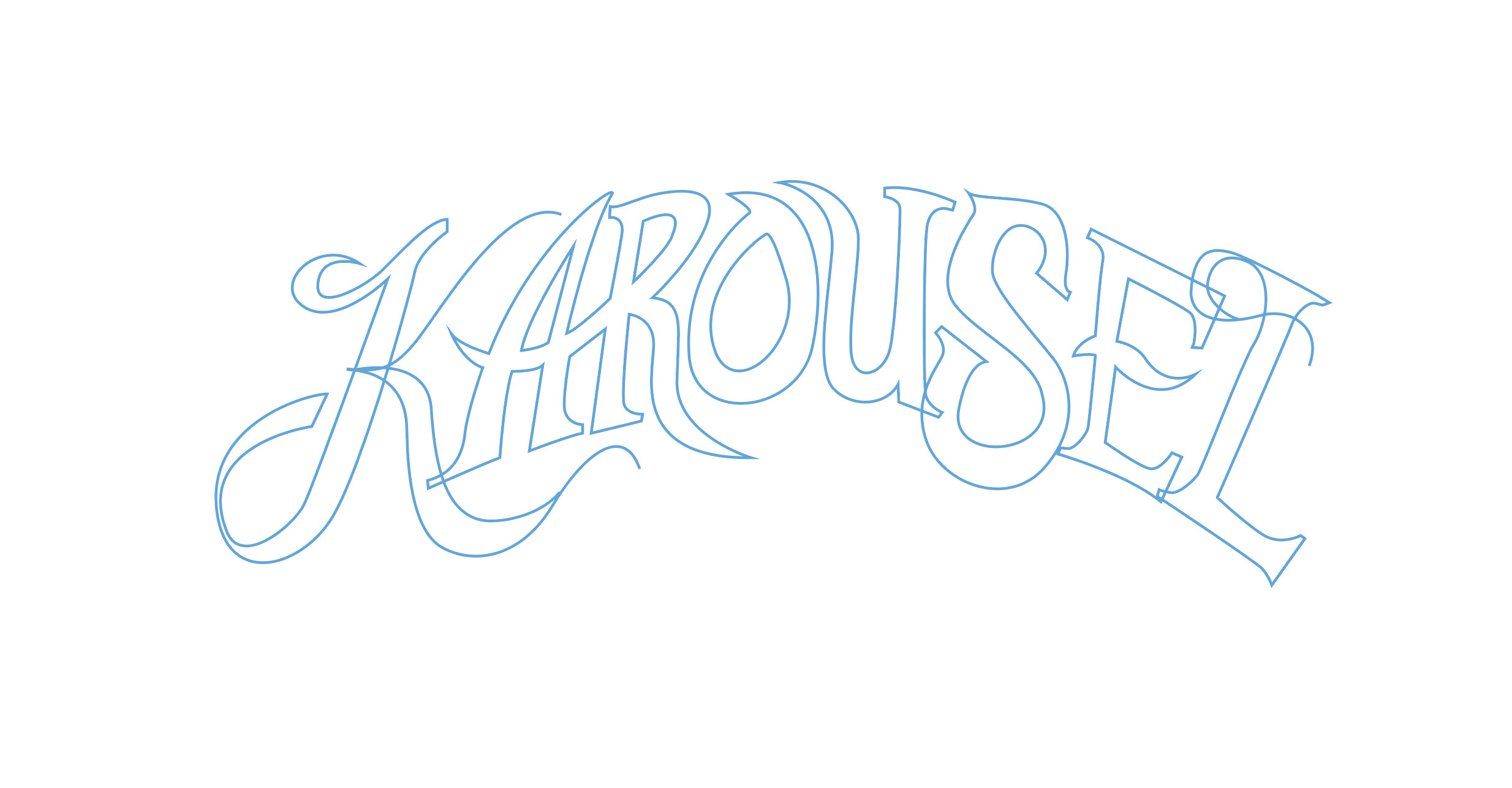
The first step for me is to get each letter form outlined. I'm not going for perfection at this point the goal is to just get something down on the art board. I knew I could tweak this thing til the cows come home but I pressed on.
Next I worked on each letterform and made it perfect. I used the curve of a couple ovals to make sure the curve was accurate. This part takes the most time because everything else is based off of these letterforms.
Once I fill it in I can start to see what needs to be tweaked and what works and doesn't. Building out the rest of the K was one of the things that I had to do to balance it.
This chisel effect is kind of my go to. It adds another level of dimension that I love. The hard part is making sure the effect works with the letters and shapes.
After a couple color options we landed on this red color. The K would be used by itself on materials so it had to be strong and stand alone. I'm happy with the way it turned out and it was a a fun process.
Tell me what you think, leave me a comment. Check out the event and the rest of the brand at www.karousel2018.com


