Jackson's Boxing Club
The Jackson's Boxing Club is a volunteer based, non-profit organization giving boys and girls from the ages 7 and up, a structured opportunity to develop skills, discipline and confidence while earning respect through participation in a boxing program - which offers educational support and tutoring in the same setting.
Chris Hardesty is a childhood friend of mine and is the head coach of the JBC. He reached out to me to design a logo for the club and I was too busy at the time to take it on. Life was crazy and my plate was full. Then the local news featured the club and the great things they were doing with the hardships they faced. Seeing that video gave me the push to reach out and see if he still needed a logo.
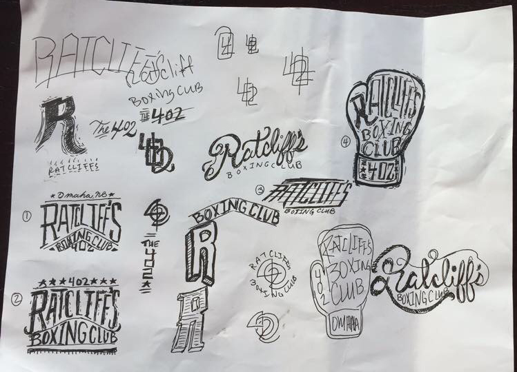
A quick message on Facebook was all it took to get his approval. I set off and started to think of ideas for the clubs identity. His direction was: simple, clean, tough and get the area code in there somewhere (402). The name we started with was Ratcliff's Boxing Club and so I decided to whip up a few sketches to get some ideas down that were racing through my head. My process is pretty thought out and really deep but I knew the final mark needed to be bold, readable with a dash of moxie. I played with some different type styles and to help speed along the process I shot over some initial sketches to Chris to gage his interest. I don't typically do this but I figured the more transparent the process; the quicker the turn around would be.
I was glad I sent these sketches to him, because a day later he came back and told me that they were not going to change the name of the club and it would remain the Jackson's Boxing Club. It was a good thing that he had picked a direction I could rework easily and all I needed to do was replace the name in the structure - which was the number 1 in the image above.
From this point I had my blue print, now I just needed to execute it. Working with custom type always has its challenges. Below is the process that I took to get me to the final logo. From sketch to vector art I'll explain my thinking of each step.
After I found out of the name change I started a new sketch to work out the placement of the new letterforms. At this point I was trying to figure out style as well as structure. I then took this lose sketch and scanned it into the computer so that I could redraw it in illustrator.
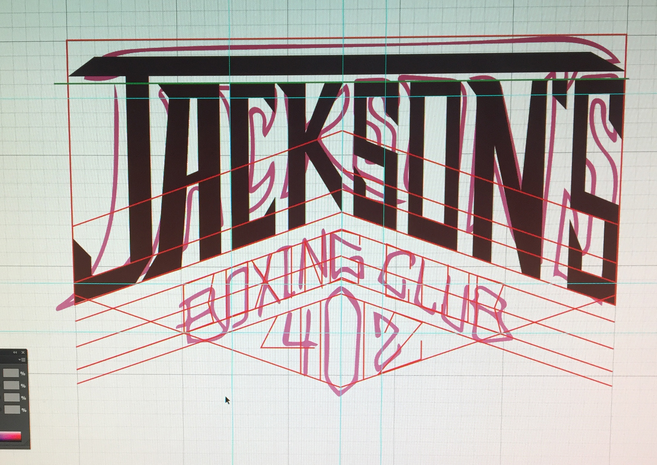
I fired up a grid and got to work on vectorizing the type. I started off lose and then refined my lines from there. The red lines show my tracing of the sketch and the black letters are a simple refinement.
I wanted to keep some of the shape of the letters sharp and pointy but I wasn't really feeling it. I then moved to making all of the letters straight and sharpening off the points, basically anything that was curved I made straight.
I went for a straighter more geometric look. The K and the J were really bothering me at this point and I wasn't sure how to make them play nice. But I liked the sharpness of the edges so I pressed on.
After hours of tweaking single points I finally got it to a place that looked good. At this point I had to stop looking at it because the spacing was driving me crazy. I couldn't put my finger on why it felt so off. Then I realized that the inconsistencies were based on the fact that my individual letters were not the same width. I also had issues with the line weight and kerning of the logo.
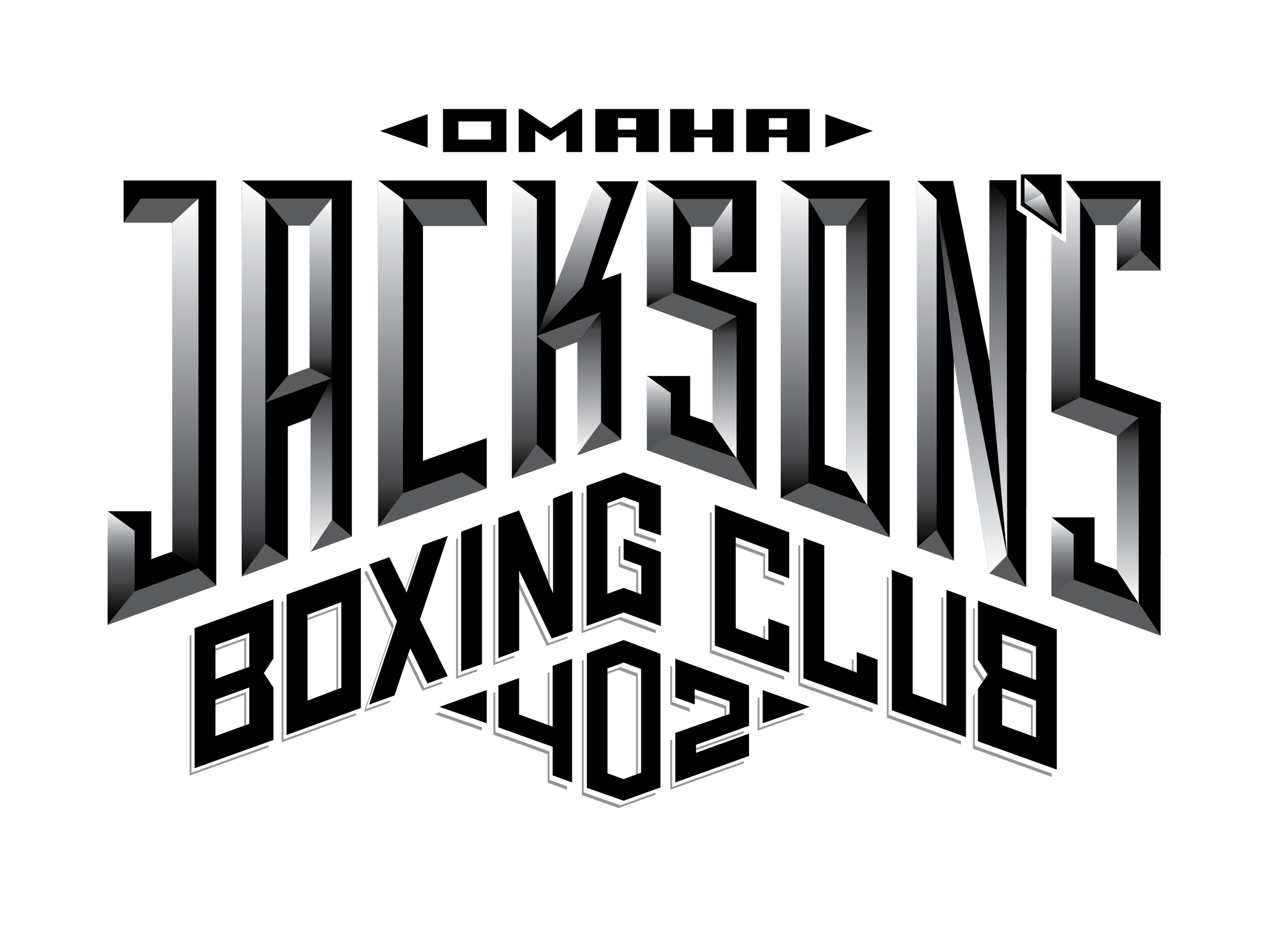
I went back in and grabbed each point and tweaked it some more until it was pixel perfect. Once I did that I felt like the entire process eliminated the personality that was in my original sketch. I then decided to add some depth to the logo by adding a custom bevel to the letter forms.
I liked where this was going and added some gradients to help finish off the look. I'm really happy with the final logo and I think it is going to look great in use. I'm glad I was able to help out a great cause and old friend at the same time.
Be sure to check out Jackson's Boxing Club online or on Facebook and if you're in the Omaha area go check it out in person.
Final Logo:
Mock-up poster:
Apparel:


